coarsewerek🎩🧐
magazines/film marketing

contents page
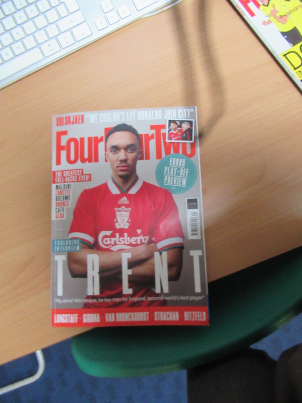
1. a mid shot was used and trent alexander arnold is on the cover he is represented as important
3. the colour palette is meant to match trents shirt and stands out to the grey background
4. the masthead is at the top and is in bold
5. two images are on the cover
6. six cover lines are used
7. the bar code is along the side along with the publisher logo
8. 1 font is used throughout but in many different sizes
9. there is one puff used in the form of a circle
article page
1.large amount of text photos dotted randomly
3. sub headings are purple text and lots of text in paragraphs
4. basic white and black
5. shows images of victory/goals in stadiums
6. no stereotypes that i can see
contents
1. it is laid out with the contents title in the middle and below is the contents of magazine
2. 12 images are used they vary in size
3. enough
4. text is organised into sections and are distinct by colour
Wednesday 129th January 2014
famous people
bright colours
shapes
cover
1 there is a range of people on the cover like harry Maguire Gareth Bale Leroy Sane Paul Pogba and more
no real shot type just spliced together photos
2 fifa transfer deals new season shirts and posters are included in the cover lines
3 background is blue while text is yellow to stand out
4 the masthead is at the top but not very top and how am i supposed to know the font
5 17 images are used
6 9-10 cover lines are used
7 barcode and producer logo is down the side of the cover
8 6 fonts are used
9 there are no puffs used
contents page
1 contents+page numbers are on left hand side and on the right are images
2 7 images used which all vary in size
3 3 fonts are used most are the same size but the name of the magazine is large
4 text is dotted around the page in puffs paired with an image and in a list on the left hand side
article
1 text is underneath images and images are put mostly on the first age. and on the right second page
2 7 images are used one is used as background and is large but the majority are portrait and dotted across the article
3 4 fonts are used some are really small and others are big titles
4 sub headings use title font and use black and red text and small serif font is used for thee information underneath
5 similar to the front cover uses blue background. red and yellow red text yellow border and also black text for normal article
6 7 people are used and they all are shown as skilled as the photos are. them on the pitch in action
7 that harry Maguire is crap
overall
1 speech bubbles and a silly kid friendly style is used for house style very colourful so it stands out
2 one genre convention used is that the player is very fit
3
Friday 131st January 2014
football
balls
1 the imagery is usually action in the match victory images in kit playing if not they are usually in a studio but still wearing kit
2 the colour palette for younger audiences is mostly bright blues reds and yellows while for adults its much more toned down
3 usually sans serif bold block caps very large
4 lots of exclamation marks command words and abbreviations used for typography
5 transfer news latest scores about certain players exclusive interviews tactics goals fixtures are a small amount of articles that are used
6 they are represented as important and skilled but stereotypically they are shown as attractive and masculine
wednesday 136th january 2014
adjectives i would use to describe the representations is strong intelligent and fit
gender is represented as very strong as his facial expression reads seriousness which is a common stereotype of strong men his forearms are also exposed connoting he isnt conscious about them
age is represented as healthy as all images of people are around the same age and all images of people are them playing the sport in action
ethnicity is represented diversely as many players from many different parts of the world are across the magazine and having a mixed darker skinned person [trent] on the cover
sport is represented as complicated as images represent many aspects of the game like goals defence VAR and more
the stereotype of football being a male dominated sport is used throughout
gender is represented as males being very strong and masculine while there arent any females i can see
age is represented as mostly 20-30 year old range but a few younger players are in there
ethnicity is very diverse as on the cover there is a large amount of players each one being a different ethnicity or nationality
football is represented as a fun sport hence all the bright colours and photos being of victory or something good
the stereotype of men being very masculine pops up consistently
friday 138th january 2014
the website of match magazine says MATCH! is the number one youth football brand - including the UK's best selling football magazine. It is the ultimate football fix, bringing its audience closer to their football heroes. MATCH! magazine features the biggest stars, the best interviews, and the latest football news every week. Online, www.matchmag.co.uk is the daily interactive footy fix that brings the MATCH! brand to life, offering the latest news, games, movies, message boards, and the MATCH! fantasy league. MATCH! has 534,000 readers aged 7-19 and 322,000 readers aged 7-11. the target audience for match seems to be young believers and strivers
the target audience audience of fourfourtwo is
• 92% of audience is male
• 59% aged under 30
• 64% play football more than
once per week
• 39% have a personal annual
income of $100,000+
• 39% have a personal annual
income of $100,000
i would say the target audience for four four two is older innovators achievers and experiencers
friday 145th January 2014
research conclusion
i am doing a sport magazine based on football this appeals to my target audience as it is usually a hobby of people of this age
my target audience is likely male football fans experiencers innovators and achievers who are involved in football based activity
some names i could use for my magazine name is FUT FUTBOL or Tiki Taka
a tagline that helps define the magazine could be the man the myth .... insert player/manager name
the style and colour pallete im going to use for front cover is have a dark background gray or black with a bright colour in the foreground
im going to have a mid or wide shot of a player or manager as my cover image
cover lines may include play on words witty lines or likely info about whats in the magazine
in the contents page im going to use not too bright colours and a modern not cluttered style
im going to have multiple images of players and moments in football games dotted around
im going to have a few larger images on my article page and have text paired with the images and maybe one page with an image as the background with less text
article will be about some recent news to do with cover star or an interview with them and then small info bites of recent things in football
will have action shots of people playing football or just images of players on the pitch
im going to use similar colour palettes and fonts throughout to show contents cover and article are from the same issue
im going to use bold font and sophisticated language for typography
im going to try to use any diveresity possible throughout my three pages if deemed necessary
friday 158th january 2014
target audience
do now
demographics is the facts of the target audience such as gender
physcohgraphics is the target audiences personal likes or hobbys
2 high earners posh chaps dudes
3 high earner women posh chaps
4 the thing on a boat that keeps it in place
5 the cover line that is the main one
1 1950s
2 major quality and some random girl
3 working class
4 google cheat sheet brain
5 /\
1 this one b
2 google the actual words used
3 what is written font style
4 wide mid shot centre shot props costume body language
5 vfx editing
do now
1 a
2 sweating like a pig feeling like a fox
3 morals/ideas/belief
4 when two texts reference each other
5 12
do now
1 font
2 2021
3 kung fu
4 when two texts reference each other
5 strong powerful
1 bbfc
2 12 and 12 accompanied with an adult
3 distribution
4 distribution
5 covid
do now
1 WB
2 WB
3 Production
4 distrubution
5 lego car decor
friday 334th january 2014
do now
1 30
2 yes
3
4
5
Monday 338th January 2014
do now
1 long
2 section b 1 and sectiion b 2
3 nea
4 two seconds
do now
1 16-24
2 magazine
3
4
5


RESEARCH - please add in subheadings as this is all very difficult to follow.
ReplyDeleteANALYSIS: good analysis
CODES & CONVENTIONS: good but a bit brief. More details would be better.
REPRESENTATIONS: a bit brief. Make sure you try to use these in your own product.
AUDIENCE RESEARCH: add a screen shot of your questionnaire and then the results.